New on Pulsar: CORE Creative tab
If one gift wasn't enough, we've got a second Pulsar product update coming your way just before the holidays. As well as our new Platform Launch Pad we're introducing the Pulsar CORE Creative Tab!
Say you wanted to understand how to create the best content. Not unusual. You would need to know the media format, what copy you should use, the images that work best for you and how you measure up to your competitors. To give you better tools to quickly arrive at a creative insight, we have added a Creative tab to the Contents section of CORE.
There are three sections of the CORE creative tab, and two new features we'd like to draw your attention to:
Format
The format tab (previously known to users as ‘media type’) has been designed to show you which media types you should include in your content to get the highest engagement and impact from your audience. For example, you can see if images are generating higher engagements than links.
Copy
The copy tab (previously known to users as ‘keywords’) shows you which keywords have been working best for your content. You can now choose the copy of your content based on what has previously generated the highest engagements, visibility, impressions or engagement rate.
Images
We have also added image recognition, which analyzes the contents of any images within your posts. So you can see (above) that the best performing image colours that work for Kim Kardashian are ‘gray colours’, whilst ‘sea green’ works for Kendall and ‘light brown’ is Khloé’s most popular colour. If the Kardashians sisters need a little help choosing the best colour scheme for their next Instagram post, they know where to find us!
Competitor Comparison
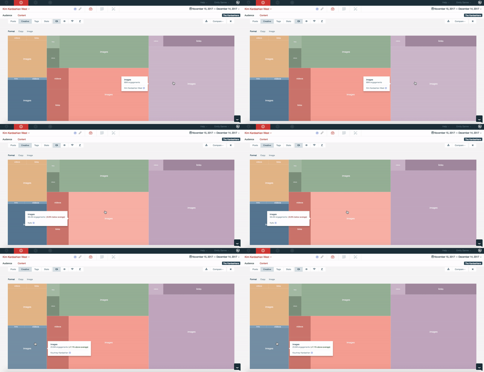
Now you can compare yourself against your competitors, and benchmark format, copy, and images within your industry. Looking at the treemap chart above, if Kim wants to see, by engagement, how the format of her content compares to her sisters, she can do this on the Format Tab. She can see that she has around 20 million more engagements on images than her sister Kylie, and 60 million more than Kourtney!
Over Indexing
Finally, we have visualized the data so you can understand competitor performance proportionally, shown by the degree of shading. The darker the shade of color, the higher that insight is performing compared to the rest of your content, and your competitors. When you hover over the tile, we will also show you the average percentage of this insight’s performance, showing whether it is better or worse.
If we look at Kylie, we can see (above) that she has 38 million more engagements on her images than Kourtney. However, the engagements she is receiving are actually -8.8% below the average amount she should be getting, compared to her content formats and those of her sisters. Equally, Kourtney is getting +7.1% higher average engagements on her images than her sisters. So despite having fewer overall engagements, Kourtney’s images are actually performing better than Kylie's.
As always, if you have any questions around the CORE Creative Tab, or any Pulsar features just open up the Intercom chat in the bottom right hand corner, and our online support team take you through them.
Happy holidays!


