Pulsar How To: Analyse social conversation with Keyword visualisations
This is the third in a new blog series where we will take you through different features on Pulsar – a step-by-step guide to show you how simple and easy the platform is to use. So far we’ve looked at Topic Searches and Clusters - this week we’re talking about Keyword visualisations and how to use them to maximise your social media insight.
Keyword visualisations are an essential part of social media listening, allowing you to understand at a glance the most popular ways people talk about your brand or topic.
They're the simplest form of text analytics. The basic principle behind all the different kinds of keyword visualisations is to simply count the number of times each keyword is mentioned in the dataset, and then visualise the size of that word accordingly. The most popular words are the biggest: intuitive, isn't it?
Keyword visualisations simplify the data so you can fully understand the dataset at a glance - either as a quick dip into the data, or as a starting point to explore interesting themes more fully.
What can I use Keywords for?
Here are a few quick ways Pulsar clients are using keywords to better understand their dataset:
- Understand the products that are top-of-mind when people talk about your brand.
- Brand positioning & perception: what are the adjectives and emotions consumers are using around your brand the most?
- Within a category search (e.g. haircare), see which brands are most frequently mentioned by consumers
- Find the hashtags people are naturally using in a category or topic, as ones that may be most relevant and natural for your brand to use
- Identify 'unknown unknowns', aka things you didn't know people were associating with your brand (or topic) and wouldn't have thought to search for directly. PR threats can fall into this category - but so do unexpected use-cases and potential innovation insights
Next we'll walk through each of Pulsar's 4 keyword visualisations in turn.
1. Keywords Word Cloud
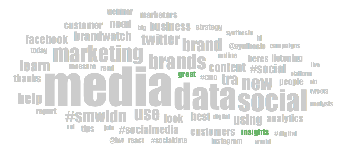
Word Cloud is simple: The bigger the word, the more times that word has been spoken about. In this search about 'social media monitoring', you can see that "data" and "marketing" are top topics too.
Here's a twist: sentiment colouring is incorporated - large green words show top keywords being used and spoken about positively. People love "insights"!
2. Keywords treemap
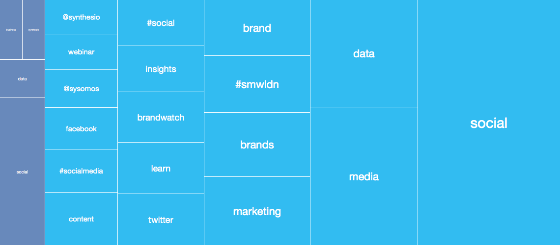
Treemap visualises the popularity of a keyword by size: the bigger the box, the more often that word appears in your dataset. It also segments the keywords by social media channel, expressed in colour. Here, words in light blue were posted on Twitter, and darker blue are Facebook. Use this to get a sense of which channels are driving which topics of discussion.
Here, for example, we can see that there are a lot more mentions of 'social media monitoring' category keywords on Twitter than on Facebook - and we can also see that "media" is the 2nd most used term on Twitter, but on Facebook it's "data".
As with all Pulsar visualisations, you can click into these boxes to view the Results tab showing all of the individual messages containing those words. Read through that stream of data to deep dive into the nuances of how people are using a word or phrase about your brand, and discover more insight about the conversation.
3. Keywords stream
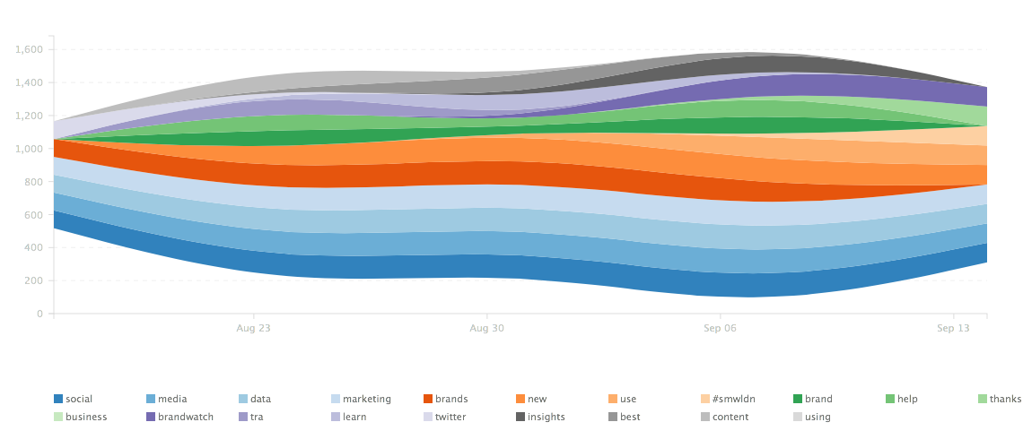
With stream, each colour line represents a different top keyword within your dataset. The thinness to thickness of the lines exposes prominent areas of discussion. The date range at the bottom of the graph allows you to see how long your top keywords are being spoken about for, and how much these words fluctuate in mentions.
Stream is great for campaign use (eg. hashtags) to see how long your promoted content is being used for by the audience and when that conversation starts to diminish.
4. Keywords bundle
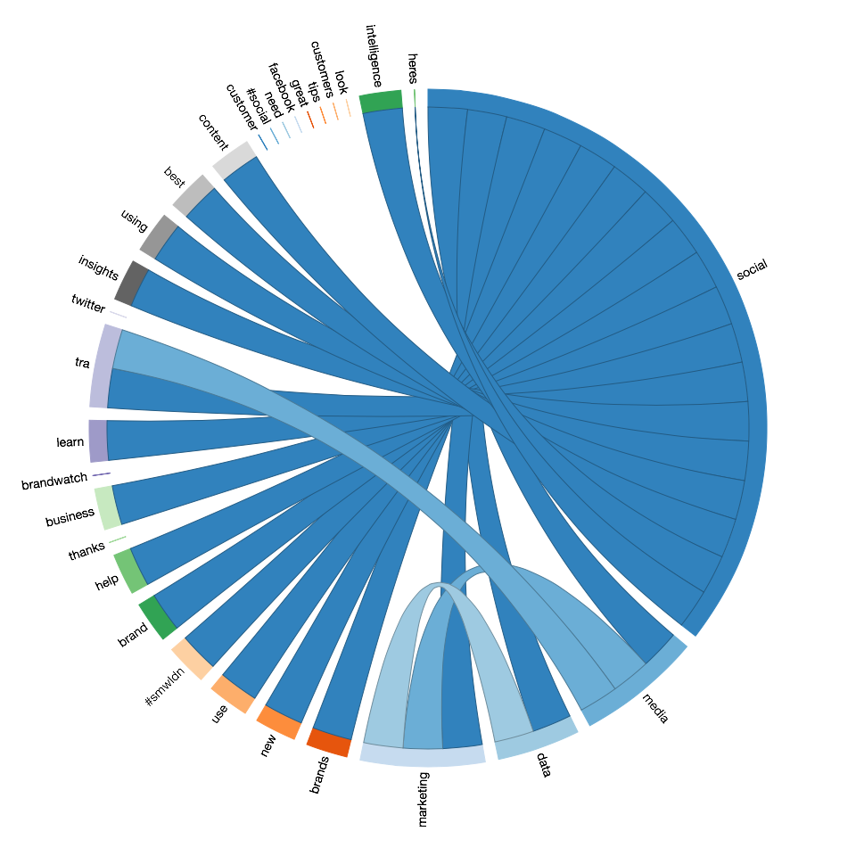
Bundle shows you how different keywords in your dataset are connected. When people say "best", what brands are linked with that word? Or vice versa: As a brand, you can see when people speak about your product and what other features or issues are mentioned the most,
The top keywords from your dataset are shown around the edges of the Bundle. When you select a keyword it will highlight the other keywords that were most-mentioned in the same content and used within the conversation.
Then, to see the individual messages where these mentions take place, use the Pulsar filter to search for content with both keywords, and read through it in the Results tab.
*
And that's a quick guide to using the keywords visualisations! Check out our other How Tos on Setting up Topic Searches and Building your own cluster charts
Or, if you want to find out more about Pulsar's visualisations in a full platform demo, please send an email to: [email protected].
