Data storytelling: how to frame narratives using datavisuals
Data visualization exists as a way to make data more insightful and easier to understand. Here at Pulsar, we uncover interesting moments and decode audience behavior by turning complex data into something that actually makes sense.
As the leading audience intelligence platform, one of the things that allows us to do this is data storytelling. We help empower marketers with strategies, researchers, policymakers, and brands to make more effective decisions. That's why we focus as much on effective storytelling as we do on technical details when visualizing our data.
Why is data storytelling important?
Here we visualize conversational data surrounding different airlines as we follow the events of various Boeing–based scandals in the aerospace industry in 2024. This chart shows how scandals from one brand impact other brands in different ways.
This animation not only simplifies that complex story and makes it easier to digest, it also allows us to glean key insights and narratives about how the Boeing story grew over time. When visualizing the impact step–by–step, this chart even suggests how Boeing might have mitigated the crisis before it snowballed into a major problem – such as tagging onto the success of Apple following the accident.
Visualizing data and then crafting stories around it helps turn abstract concepts into jumping–off points. We’re going to dive into how to create actionable information using concrete examples and human, research–led data analysis.
Picking out a simple narrative isn’t always easy – let’s dive into how we approach complex data–based narratives and how to make the right choices when visualizing your data.
Find the right story
Deciding which story you want to tell will dictate how you want to visualize your data. Using the appropriate type of chart can increase your audience’s resonance with the narrative you’re aiming to get across. For example, bar charts are great for showcasing rankings or hierarchies. However, they can often tell a two–dimensional story that doesn’t necessarily offer deeper insights.
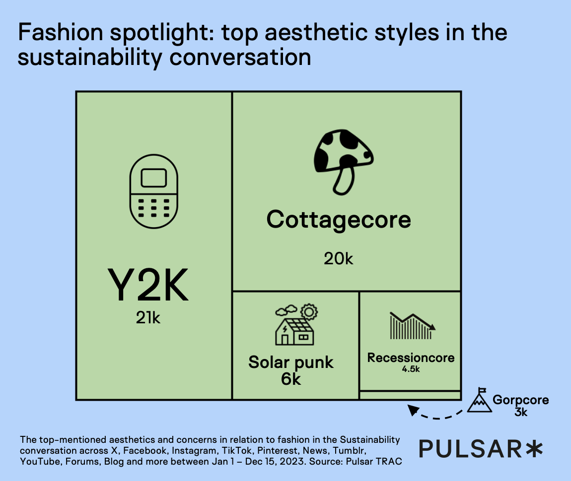
Adding additional layers to a bar chart, such as iconography or a color–coded system to show categorical differences, can show more layers of storytelling. For when further layers aren’t needed, using the same data in a treemap or size–based vector chart could tell the same story but with an added aesthetic benefit whilst simultaneously making size comparison more interesting and easier than with a simple bar chart.

When choosing how to display information, simple visual cues can help readers better understand the association between the raw data presented to them and its meaning. These factors also help resonate emotionally with the audience, which is a really important part of storytelling.
Emotional resonance with your audience can maximize the impact of your research despite using the exact same set of data. If you spend a long time researching, analyzing and creating something – whether it's for internal or external purposes for your brand – there’s a necessity to get across the value of all the information in your research as succinctly as possible in order to stand out in potentially busy environments.
Choose the right type of data viz
Consider a scenario in which you present a chart as part of a 20–page research deck – 20 pages of bar charts is going to struggle to engage any audience. We think about our charts as objects of interest – something that means as much to the readers as it does to us.
This is why it’s important to fully consider the type and variety of visualizations used in your data analysis – using the right data visualization can make your audience not just understand, but actually care about what they’re looking at.
Here we look at the sub–audiences of a recent Fortnite x Disney collaboration correlation and their affinity to the franchises of Fortnite, Disney, Star Wars and Marvel. When researching, our team initially visualized the above as a heatmap of numerical data, with the stronger correlations displaying as a darker color. For people well–versed in the dataset and its meaning, the initial chart was a great way of displaying these correlations and understanding anomalies. However, though the same information was immediately available to readers – the same immediate affectation wasn’t happening.
When visualizing on a radar chart such as the one above, readers can quickly see which sub–audiences map to which franchises. The radar chart makes it easy to see that the audience is not monolithic, that Brazilian Pop Culturists and Pop Culture Fangirls have the most diverse range of interests. When looking at the very rigorous and interesting heat map described before – that information took a lot longer to glean.
Using the right visualization can break down these complex stories – and helps diffuse the intensity and density of the data points. In this case, it’s much easier to see where Disney needs to target their audiences more effectively. Being able to understand which direction your audience and its subsections are looking in which direction is important – and the right visualization can help you understand that with immediate ease.
Simplify complexity
When creating visualizations for complex data, confusion is an easy trap to fall into. Adding layer upon layer of analysis to inform your readers brings the temptation to include everything you know from your research is strong. But what happens when there’s simply no way around it – when there’s no way of removing any element of analysis and all of them must be included?
As the above clip shows, it’s important to avoid overwhelming the reader. Though a fancy, information–loaded chart may look impressive, it’s important to note that being comprehensible trumps being extravagant.
The visualization in the above clip went through many different iterations and feedback rounds. This is one of the main tips we can offer to improve comprehension and concision in your data visualization: get feedback. Do people in (and out of!) your target audience understand what they’re seeing? How long does it take them to understand? Which elements confuse them the most? Seek tips and feedback from trusted advisors, and workshop different versions of your visualization for them and for yourself.
Data storytelling is really all about decision–making. With so many compelling stories out there, we always need to grab attention quickly. Take a look at how quickly brands and individuals go viral – the window of opportunity to make an impact is small. Finding the hook to your story will help to input the visual cues that point the audience towards the simplest route to understanding the data.
Everything in the visualization needs to help tell that story in an engaging way – every line, dot, dash, sentence and icon goes towards simplifying and making the data more accessible to a wider audience.
Contextualize data
As researchers, seeing so much conversation unfolding in a fascinating way helps us see the bigger picture. When we dive into our research, we’re sifting through hundreds or even thousands of individual posts from an extensive subset. We find ways to condense and contextualize the story exactly as we see it, and then show it to the audience.
It’s important to create a compelling narrative within each single chart – no matter how many charts you’re presenting. A lot of concepts are tough to express in numbers alone. We often embed qualitative examples in our blogs and reports, which is an excellent solution when explaining something new or complex that doesn't easily translate with qualitative data.
We need context to bring trends into perspective and to guide the audience to see the bird’s eye view of your research. This can be done in a variety of ways – you may have the opportunity to use a visualization to specifically add perspective to your research. If presenting multiple visualizations as part of research, you can strategically plan which charts you use in order to let them contextualize each other.
The above chart shows some of the context surrounding the backlash surrounding podcaster and wellness guru Andrew Huberman’s ‘five girlfriends’ scandal. (You can read our full blog on the scandal here.)
We always want to understand both the qualitative and quantitative aspects of our research. This chart spotlights some key qualitative examples of the backlash – it shows how the conversation unfolded across a variety of data sources.
This chart zooms in on the details of top posts in the Huberman conversation. We use this visualization to show the conversation from the abstracted data right into the actuality of the audience. We show a range of sources from the most anonymous posts on platforms like Reddit and YouTube comments to big–hitting cultural institutions such as Time Magazine and BBC Radio.
All of these sources hold varying levels of cultural influence and are key to understanding the conversation surrounding a topic – the Reddit post and the Time Magazine article may have the same level of visibility online, with the same amount of clicks or views – but the magazine holds a lot more cultural weight.
This illustrates the different facets of the conversation surrounding the Huberman backlash and how it evolved. This is a way we wanted to present the information, showing the data we found without needing numerical or quantitative visualization.This approach takes qualitative examples and demonstrates exactly what's happening and where – whilst backing this up with qualitative data in the rest of the blog.
Adding contextualizing visualizations is a really effective solution for presenting complex research, especially for social media professionals, because many recent social trends are challenging to explain directly.
What about when you don’t have the opportunity to use another chart to add context? If you need to have all of your information articulated in just one chart, it’s often important to include context within the chart.
Detail-oriented storytelling
Sources
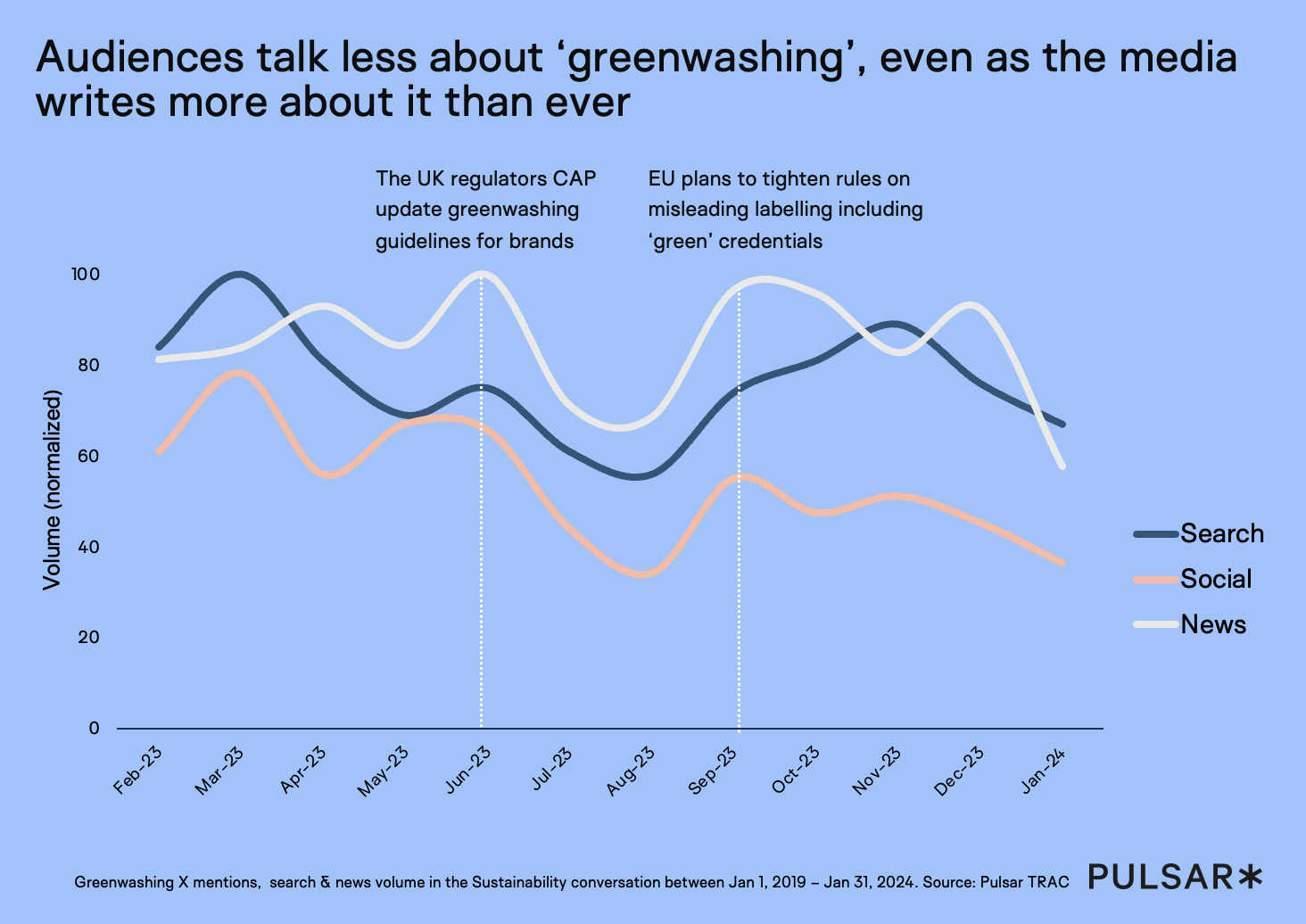
Including more sources helps contextualize the conversation as it relates to the wider world. Social sources reflect online interest, search data shows consumer intent, and news data tracks how the media are participating in the narrative. By blending these insights from additional sources together, we can add new layers of understanding that might otherwise go unnoticed.
Annotations
Adding annotations, legends and call–outs provides extra context, making your narratives clearer. They are a powerful tool in visualizations where there are multiple stories to explore – the reader can glean different insights from the chart the longer that they look at it . Annotations help hold attention and serve as both a guide and a branding tool, showing people exactly what we want them to take away from the visualization.
Titles and subtitles
Our titles always serve as the hook for the story, so we put a lot of effort into crafting it – it’s the first thing your audience sees. Having a strong title is crucial for enhancing the visualization, so take the time experimenting with different angles to find one that encapsulates what you need to convey with concision.
As well as telling the reader what we’re seeing, readers don’t need a title that simply says literally what they’re seeing – the chart will show that for itself. It’s important to not simply spell out exactly what the reader is seeing and instead give a headline that makes it interesting and prompts the reader to want to know more.
Let your title help the reader to zoom in on what you want them to see. Copywriting is a significant part of the visualization process. Spend a lot of time drafting, refining, and editing the text to guide the audience through the story in a logical flow, from the context to the insight. It's important to craft a narrative that leads the audience towards a conclusion, or even a call to action, depending on the message you’re trying to convey.
Aesthetics
Aesthetics play a crucial role in creating a compelling visualization that captures the audience’s attention, while also reflecting a brand identity. But color logic can also be used to add context. Use a few bold colors to highlight the story and declutter unnecessary design elements. For example, removing excessive tick marks or using muted colors to de–emphasize secondary details helps keep the visualization clear, yet engaging and on–brand.
Ultimately, visualization is not just about making something visually appealing – it’s about designing the entire process in a way that makes the story effective.
Sequencing stories
Using time sequencing is a powerful way to tell stories that involve complex narratives. It's not naturally easy for our minds to conceptualize how different conversations move through time, but by breaking down each story as it unfolds, and putting those events in order, we can get a much clearer picture of what actually happened. This approach highlights key moments that in a brand context shows opportunities that could have capitalized on.

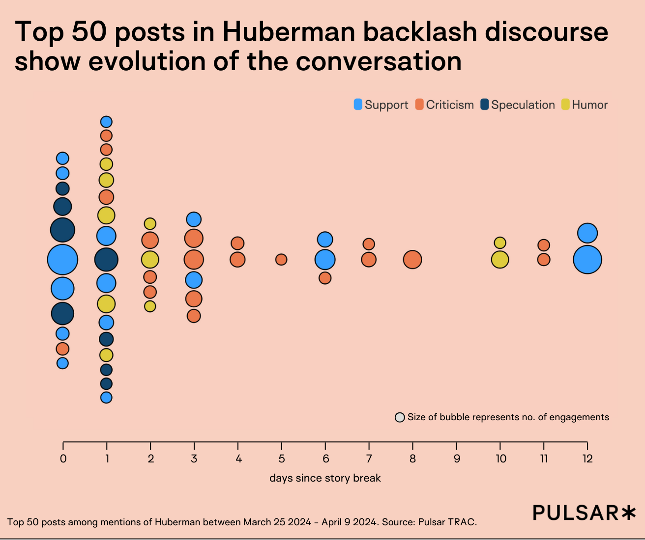
The above chart again examines the Huberman backlash outlined in the previous section. Each dot here represents one of the top 50 posts during the first two weeks after the scandal broke. There’s a mix of support and criticism, which we’ve categorized into support, criticism, speculation, and humor. Here we can see how different types of content shape the conversation, with the top posts’ narrative shifting from initial support to sustained criticism.

Sequencing stories is essential in data storytelling because it keeps audiences engaged and curious about what happens next. This takes us step–by–step through the Huberman backlash, showing how sequencing encourages the audience to dive deeper into the data. As viewers follow the narrative, they might get curious about specific points and want to explore more.
Here everything in the chart adds another layer to the story – the size of a dot, its color and its place on the x–axis. The inclusion of effective sequencing turns complex data into compelling stories that resonate with the audience, making the insights more accessible and actionable.
To stay up to date with our latest insights and releases, sign up to our newsletter below:
This article was created using data from TRAC


