Journey of an image: from a beach in Bodrum to twenty million screens across the world
I first saw the picture of three-year old Syrian refugee Aylan Kurdi lying lifeless on a beach in Bodrum, Turkey on September the 2nd on Twitter. It felt like getting punched in the stomach. But while I was shocked by it, I didn’t realise how impactful it was going to be until the next day, when the same image started to appear in my Facebook newsfeed.
While on Twitter I read the news headlines carrying the picture and reporting the tragedy, on Facebook it was easier to stumble upon the social context of the image. This included the comments of people who were actively engaging with the image and were debating immigration. And that’s when I noticed that the comments seemed to have a different tone from the conversation we had been seeing in the press and social media until then. A lot more people now seemed to be talking about “refugees” rather than “migrants”.
The shift, if that was the case, could have been significant: a “migrant” is someone who’s got a choice (and according to some, often an “economical” reason to move) while a “refugee” is someone who has no choice but to flee their country to survive. The term that the politicians, the media and the people would end up adopting to talk about the issue would inevitably have massive implications in terms of humanitarian aid and policy making.
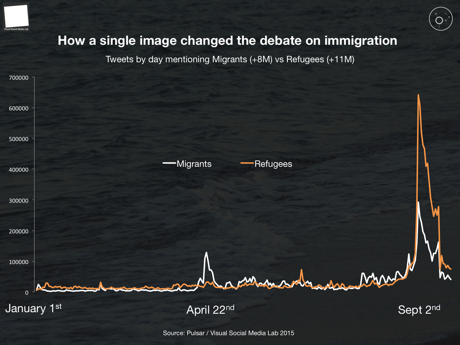
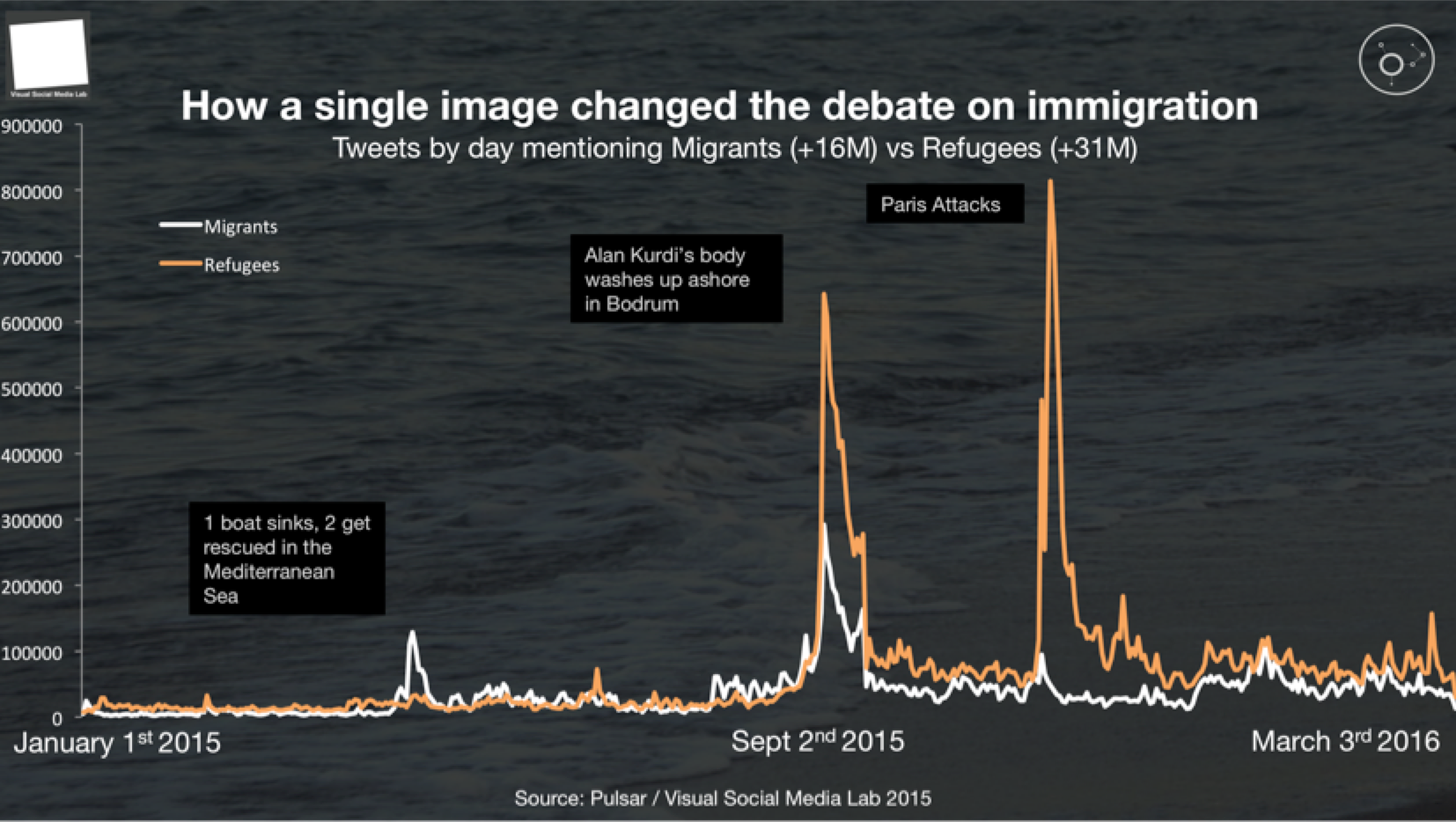
Was public opinion on Twitter changing as a result of exposure to the pictures of Aylan Kurdi? The answer is in the chart below. While for most of 2015 “migrants” and “refugees” are head to head in public opinion, accounting for pretty much the same volume of conversation over nine months (5.2M vs 5.3M), from September the 2nd onward public opinion radically flips towards “refugees” (2.9M vs 6.5M).
At the moment of writing, almost eight months after the pictures were published, the gap between the two conversations has widened further with more than double the amount of conversations referring to refugees rather than migrants.
The Turkish press covers the story
At 8.42AM, Turkish news agency DHA (Dogan Haber Ajansi) are the first to report the death of 12 Syrian refugees drowned while trying to reach the Greek island of Kos on a dinghy boat. The article, in Turkish, featured a gallery of 50 pictures taken earlier that morning on the beach of Bodrum where the bodies where first discovered. Amongst those 50 pictures, four featured Aylan Kurdi. The DHA article leads with one of the pictures of Aylan. Twitter is silent. At 9.10AM, another Turkish news agency, Diken, cover the story with another article in Turkish, leading again with a picture of Aylan Kurdi. Twitter is still silent.
The first tweet carrying the picture
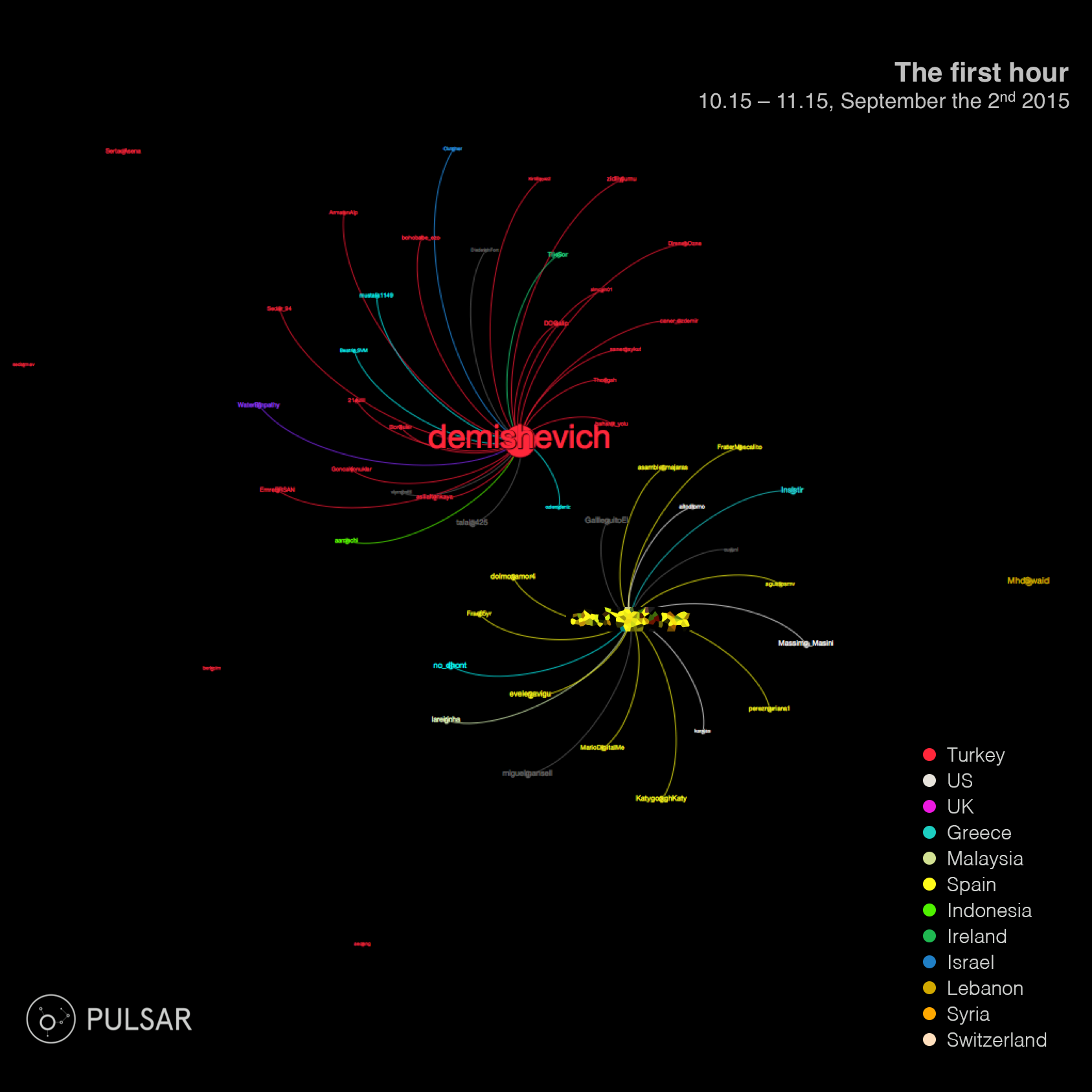
At 10.23AM, less than two hours after the story has been reported, the first post carrying one of the pictures of Aylan Kurdi appears on Twitter. Michelle Demishevich, the author, is a Turkish journalist and activist. The post doesn’t link to any news source, it only features a caption, the picture and five hashtags including #Refugeeswelcome and #Syrianrefugees.
Within an hour the tweet generates 33 retweets and a handful of other tweets carrying the picture start to crop up from Greece and Spain, but the audience is mostly Turkish (in red in the graph below).
At this point the Turkish press is starting to cover the story more heavily and between 11.00 and 11.30AM more than 15 publications start posting articles in Turkish on their websites. But whilst the press is spreading the news to a mostly Turkish audience, the images have now embarked on a very different journey on Twitter.
The images spread through the Middle East
The Turkish press has now taken to Twitter with agency Diken and Haber Analyz expanding the local audience. Images are now starting to spread through the Middle East carried by tweets arriving from Lebanon, Gaza and Syria. Journalists, activists like Free Syria Media Hub (@Free_Media_Hub) and politicians such as the ex Minister of Health in the Hamas government of Gaza, Basim Naim (@basemn63), are getting involved on Twitter.
Lebanon is particularly key in spreading the images in the region with Newsweek Middle East correspondent in Beirut, Martin Jay, suggesting for the first time that the picture might be going viral. Less than an hour later, Emergency Director at Human Rights Watch, Peter Bouckaert (@bouckap) from Geneva posts three pictures of Aylan Kurdi and comments on the need for an urgent plan to deal with the crisis. His tweet receives 664 retweets from a variety of countries including the US, the UK, Australia and Malaysia. The pictures have now left the Middle East. The story has gone viral.
[caption id="attachment_2964" align="aligncenter" width="604"]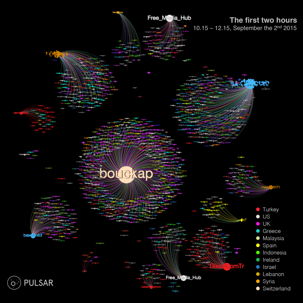 Diffusion graph B: 2 hour in from the appearance of the first picture on Twitter. Size of the nodes indicates impact on the audience (Visibility Score). Colour of nodes and edges indicates country of the user. Source: Pulsar[/caption]
Going Viral (& Global)
If a handful of tweets with a few hundred retweets were enough to claim virality, what happens next will require a redrawing of the scale of the event completely.
So far the pictures have been shared on Twitter less than 500 times in two hours (3% of the total diffusion of the images at the end of day 1) and have reached an audience of half a million Twitter users across 100 countries.
That’s when, at 12.49PM, Washington Post Beirut Bureau Chief, Liz Sly (@Lizsly) weights in sharing a tweet that will end up being retweeted 7,421 times, becoming the most viral post in the dataset. Liz Sly changes the scale of the diffusion generating in the first 30 minutes of her post the same amount of tweets that had been generated in the previous two hours.
And it’s not simply the scale that’s changing: the composition of the audience is becoming truly global. New posts are now coming from Lebanon, Iraq, Palestine, Syria, US, Switzerland, Spain and are getting retweeted by an audience that is now mainly out of the Middle East and from the US (17%), Spain (10%), UK (9%), India (4%), Netherlands (3.4%) and Greece (3.4%).
[caption id="attachment_2967" align="aligncenter" width="627"]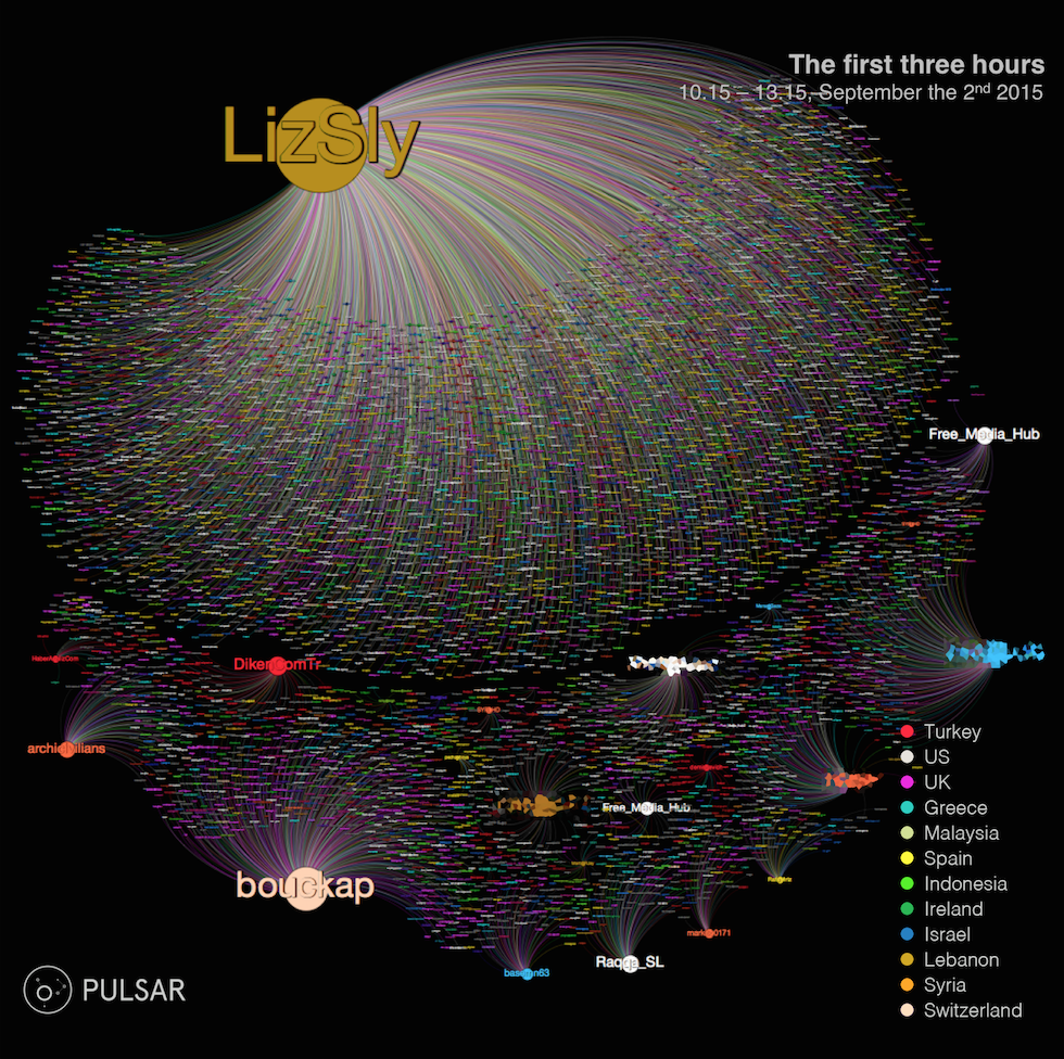 Diffusion graph C: 3 hour in from the appearance of the first picture on Twitter. Size of the nodes indicates impact on the audience (Visibility Score). Colour of nodes and edges indicates country of the user. Source: Pulsar[/caption]
At this point in time, almost five hours after the photos have been published online and three hours after they appeared on Twitter first, the Turkish press is the only one officially covering the story, no international news organisations are covering it. And in the void left by the media Twitter has managed to amplify the story to a global audience. But it hasn’t simply seeded the story globally. Twitter acted as a decentralized catalyst that has delivered the story to a highly relevant group of people (journalists, activists, politicians, aid workers interested in the region) along the edges of its social (who’s following whom) and interest graph (who’s clicking on the same hashtags or searching for similar topics). It is this dynamic that’s behind the extremely high engagement rate in the dataset (17 retweets for every single tweet posted).
This doesn’t mean that journalists are not getting involved in this process. In fact, they are leading and engineering the viral spread of the images, but they are posting their content exclusively on Twitter and independently from their publications.
For the first international publication to release an article on Aylan Kurdi we have to wait until 1.10PM when the Daily Mail publishes their first story on the matter: “Terrible Fate of a tiny boy who symbolizes the desperation of thousands”.
Going mainstream
The Daily Mail story kicks off an entirely new phase of the diffusion characterized by the heavy involvement of the international press. Between the Daily Mail article and the end of the day more than 500 articles are published online and shared on Twitter of which 35% from the UK and the US. The Independent, Huffington Post, The Guardian, Mirror, Mashable, ITV, CBS, NBC, Aljazeera, NBC, Metro, El Mundo, Reuters all run their leading stories within the next five hours and a second wave, heavier in US news and focused on the next days front pages, is published from 7PM onwards.
[caption id="attachment_2970" align="aligncenter" width="604"]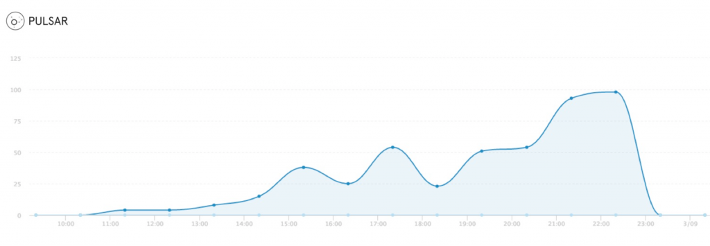 News Timeline Sept 2nd 2015. Source: Pulsar[/caption]
The huge influx of news content leads to the peak in mentions and reach between 9 and 10PM (6K tweets/hour carrying a relevant image and 20K tweets/hour talking about the story overall). But it also changes radically the shape of the diffusion of the images, featuring official accounts from editors and news publications pushing their own angle on the story rather than simply sharing the images.
[caption id="attachment_2972" align="aligncenter" width="604"]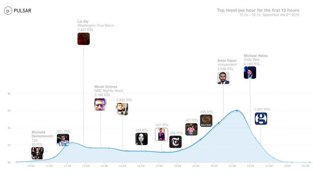 Tweet Timeline, image-only (Sept 2nd, 08.00 to 23.59). Visualising the top tweet by number of retweets for every hour. Source: Pulsar[/caption]
Compared to the previous phase of the diffusion, the audience exposed to the story, sharing the images and talking about them is now 25 times bigger. However, by the end of the day, it is the news ecosystem that ‘owns’ the story and uses it to carry its own content rather than just the pictures.
[caption id="attachment_2975" align="aligncenter" width="604"]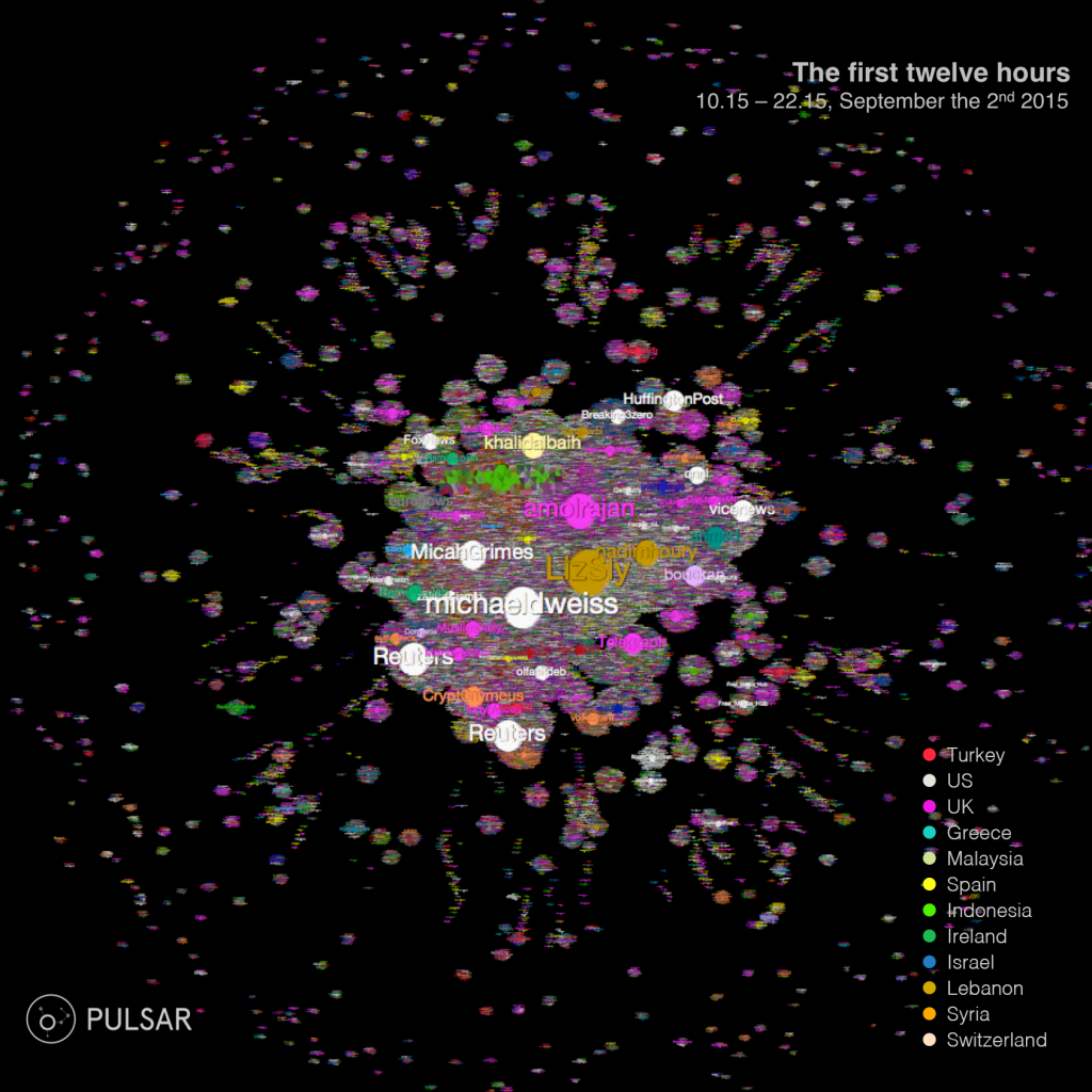 Diffusion graph D: 12 hours in from the appearance of the first picture on Twitter. Size of the nodes indicates impact on the audience (Visibility Score). Colour of nodes and edges indicates country of the user. Source: Pulsar[/caption]
The trend continues the next day where the volume of news content keeps growing and fuels the overall peak of tweets, which is reached at 53K/hour at 8PM on September 3rd. After that, both Twitter activity and news content start to gradually decline for the following 10 days until they go back to 50% of the levels reached on September the 2nd.
[caption id="attachment_2977" align="aligncenter" width="604"]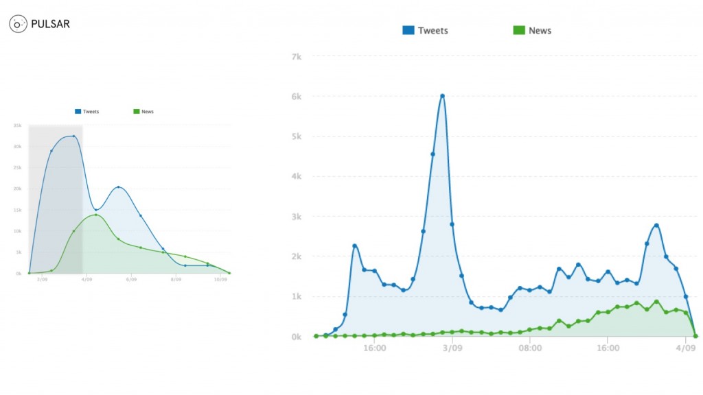 Tweet Timeline vs News Timeline by the hour, all tweets (Sept 2nd, 08.00 – Sept 3rd 23.59). Source: Pulsar[/caption]
Although the appearance and growth of news content has radically changed the velocity of diffusion, the size of the audience reached and the composition of that audience, it hasn’t changed the key behavioural dynamic of the story. Throughout the first 12 hours and through the rest of the viral cycle, the diffusion of the story has remained consistently image-led.
[caption id="attachment_2979" align="aligncenter" width="604"]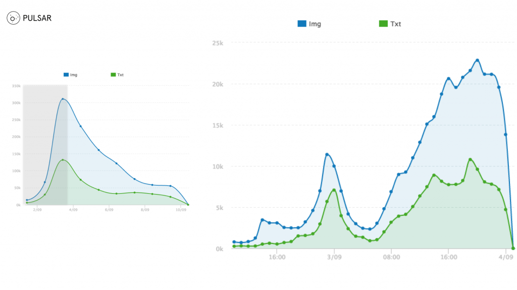 Image-Tweets Timeline vs Text-Tweets Timeline by the hour (Sept 2nd, 08.00 – Sept 3rd 23.59). Source: Pulsar[/caption]
Within this dynamic, a visual narrative has emerged as the images going viral have changed over time. Whereas the original images of Aylan Kurdi have dominated the first 48 hours of the diffusion cycle, from September the 4th onward they have been replaced by user-generated variations on the original images designed by illustrators and graphic designers. The need for sharing the impactful images and the concerns over hurting the sensibility of the audience have led, within the first 12 hours, to the creation and diffusion of surrogate Aylan Kurdi images designed to mitigate the brutality of the original images in order to sustain the visual narrative of the story and its diffusion.
[caption id="attachment_2981" align="aligncenter" width="604"]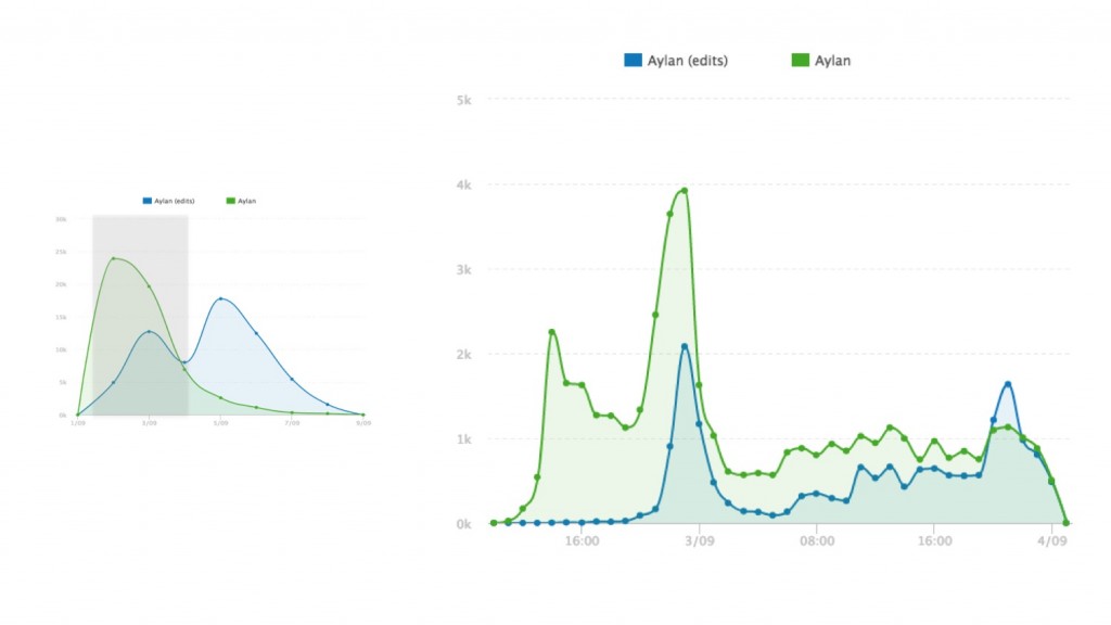 Aylan Kurdi Image-Tweets vs Variations Image-Tweets by the hour (Sept 2nd, 08.00 – Sept 3rd 23.59). Source: Pulsar[/caption]
This is a visual narrative deeply intertwined with Twitter’s ability to act as a catalyst, connect emerging stories and relevant audiences. Its ability to develop and connect those audiences to a global scale and make a story go mainstream before the international press has even started covering it. But we shouldn’t forget that it was the journalists on the ground that broke the story on Twitter and through the social platform put it in front of the right audience, facilitating a very effective and optimized diffusion dynamic.
[caption id="attachment_2982" align="aligncenter" width="604"]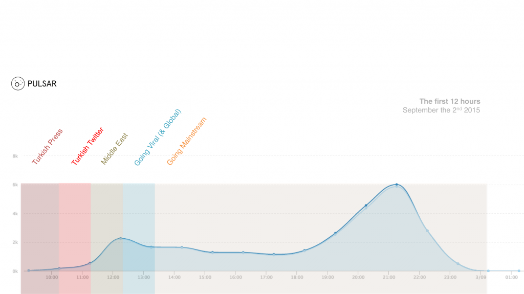 Tweet Timeline by the hour, image-only tweets (Sept 2nd, 08.00 – 23.59). Source: Pulsar[/caption]
The original study 'The iconic image on social media: a rapid research response to the death of Aylan Kurdi', which was produced by Visual Social Media Lab, can be viewed in full by clicking here.
